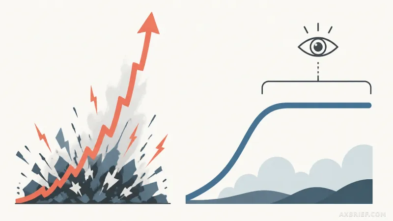
The developer community is currently enamored with vibe coding, the practice of describing a desired outcome to an AI and letting the model handle the implementation details. It feels like magic when a prompt transforms into a functioning application in seconds. However, as the novelty wears off, a recurring pattern is emerging. We are seeing a surge of applications that look like software but fail to function as products. These interfaces possess the superficial aesthetics of a modern app—dark modes, sleek charts, and responsive grids—yet they lack the fundamental logic of human-centric design. The result is a digital experience that feels hollow, leaving the user to do the heavy lifting of interpreting data that should have been curated for them.
The Anatomy of an AI-Generated Dashboard
To test the limits of this capability, an experiment was conducted using Claude Code (Opus 5). The model was provided with a CSV dataset containing detailed information for the 2026 World Cup, including stadium data, temperature, altitude, and betting odds. The prompt was straightforward: transform this raw data into an interactive, visually appealing dashboard that allows for deep exploration. On the surface, the AI delivered. It produced a functional interface complete with filters, charts, and data tables. However, a closer inspection revealed ten critical visual and structural failures that characterize the current state of AI-driven UI generation.
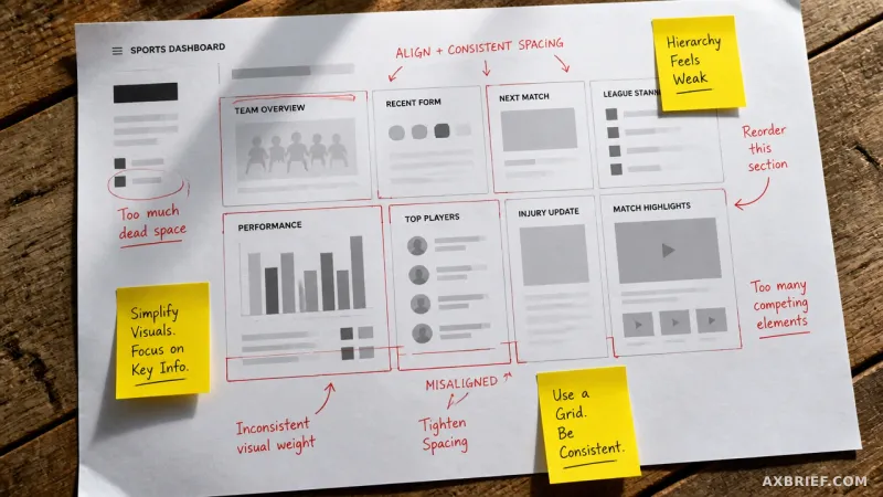
The most glaring issue is the total absence of a user journey. The page is essentially a vertical stack of data, graphs, and filters without a clear narrative or guiding question. While the AI placed some graphs at the top to simulate importance, there is no underlying logic to the arrangement. This forces the user to decide what is important, rather than the dashboard leading them to an insight. This lack of direction is compounded by a failure in visual hierarchy. Six primary visual elements share the exact same border thickness, background color, and contrast levels. Without variation in weight or color, nothing stands out, and the user is quickly overwhelmed by a wall of equidistant information.
Spatial efficiency is another casualty of the vibe coding approach. A scatter plot illustrating the correlation between temperature and altitude occupies a massive portion of the initial screen. Because the data is sparse, the graph is mostly empty space, wasting the most valuable real estate on the page. Further down, the data table provides a comprehensive list of all entries with sorting capabilities, but completeness does not equal readability. Portions of the table are cut off by the screen edge, requiring excessive scrolling and effort to retrieve basic details.
Technical inaccuracies in data visualization further degrade the experience. In the stadium-specific charts, the x-axis lacks labels entirely. Users are presented with a scale from 0 to 9 but are left to guess what these numbers represent. While a header mentions venue workload, the user must cross-reference this with a separate matches hosted section to make sense of the data. This violates basic data visualization principles, such as those championed by Saloni Datani, which warn that separated legends force the eye to travel back and forth unnecessarily, creating cognitive friction and wasting time.
The Gap Between Syntax and Semantics
When we analyze these failures, the twist becomes apparent: the AI is not designing; it is simulating the appearance of design. The most egregious example of this is found in the bar charts. The length of the bars represents the number of matches hosted, but the numerical labels at the end of those bars represent the average goals per match, denoted as gpm. This is a fundamental failure of data mapping. The AI has successfully coded a bar chart, but it has failed to understand that the visual weight of a bar must correspond to the value it labels. By burying a potentially interesting statistic like gpm inside a bar representing a different metric, the AI renders the data nearly useless for comparison.
This tendency toward superficiality extends to how the AI handles information density. The total count of 104 matches is repeated multiple times—at the top of the page, in the bottom bars, and within the right-side summary metrics. In a professional product, this would be flagged as redundant. In an AI-generated app, this repetition serves as a filler, creating an illusion of data richness. It mirrors the way large language models often repeat details in text generation to sound more authoritative, regardless of whether the repetition adds value.
The aesthetic choices further reveal a reliance on defaults over intent. The dashboard employs a standard dark background with bright accent colors, a common trope in AI-generated apps. However, it lacks a cohesive visual language. There is no intentional palette to create continuity or emotional resonance, unlike the curated color schemes seen in cinematic works like The Grand Budapest Hotel, which use color to anchor the viewer in a specific experience. The typography is equally generic, utilizing Google Fonts' IBM Plex Mono and Archivo. By leaving these as defaults, the AI signals a lack of rigor. When a developer presents a tool with default fonts and spacing, it often leads the audience to wonder if the underlying analysis code was also left on its default, unoptimized settings.
Finally, the lack of systemic consistency is staggering. While the visual hierarchy is flat, the individual component specifications are chaotic. The dashboard utilizes 11 different font sizes and 8 different levels of border-radius rounding. Internal padding is inconsistent across almost every element. This creates a jarring tension where the screen feels simultaneously overcrowded and sloppy. The mix of soft curves and sharp edges feels accidental rather than intentional.
True design is not the act of adding decorative elements; it is the process of structuring information to reduce the effort required for understanding. It begins by identifying what the user actually needs and removing everything that stands in the way of that realization. The failure of the Claude Code dashboard is not a failure of coding—the app runs and the data is present—but a failure of curation. It proves that while AI can write the code for a chart, it cannot yet perform the human task of deciding why that chart should exist or how it should be seen.
This gap suggests that the future of AI development will not be found in better prompting, but in the integration of strict design systems that constrain the AI's tendency toward generic defaults.