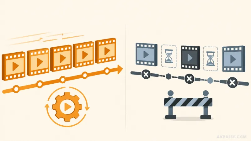
Every data analyst knows the specific dread of a Friday afternoon spent in Excel. It begins with a raw CSV file delivered via email, followed by hours of manual column scrubbing, the tedious creation of charts that will inevitably be questioned, and the mental exhaustion of typing out a narrative that explains why the numbers look the way they do. This manual loop is not just a time sink; it is a vulnerability where a single misplaced cell reference can lead to a catastrophic reporting error. The industry is currently shifting away from this artisanal approach toward automated pipelines that treat data as a flow rather than a static file.
The Six-Step Architecture for Executive Reporting
The transition from a raw data dump to a boardroom-ready HTML report now follows a rigid six-step pipeline: clean, explore, chart, AI insights, recommendations, and final report generation. The core of this workflow is built around a dataset named `product_sales.csv`, consisting of 45 transaction records. Each row represents a payment event containing the country, date, amount, and status. The status field is the critical pivot point, distinguishing between a purchase and a refund. While 45 rows may seem small, this scale allows for the precise validation of the logic before deploying the pipeline to datasets with millions of entries.
Accuracy begins with the cleaning phase. In the raw data, not every transaction is a successful business event. There are pending or failed payments that, if left unchecked, would artificially inflate revenue figures. To prevent this, the pipeline employs the Pandas library to filter for only completed transactions.
df = df[df['status'] == 'completed']This boolean indexing removes three problematic rows, leaving 42 verified transactions. This step is the foundation of the report's integrity. Without it, the subsequent analysis is built on a lie. Once the data is clean, the pipeline calculates the financial reality: a gross revenue of approximately 13,000 dollars. However, after subtracting 4,875 dollars in refunds, the actual net revenue stands at 8,100 dollars. The most alarming metric uncovered during this process is a refund rate of 38%. In a standard e-commerce environment, a 38% refund rate is a red flag indicating systemic product failure or a severe mismatch between marketing promises and product reality.
From Static Numbers to Behavioral Signals
While the summary numbers provide the what, visualization provides the why. By segmenting the data by geography, the pipeline reveals a startling anomaly: net revenue in the Canadian market is exactly 0 dollars. Every single completed order in Canada was eventually refunded. A high-level summary of global revenue would have masked this regional collapse, but geographic visualization makes the operational risk impossible to ignore.
When the data is plotted on a time axis, a more sinister pattern emerges. Through early April, the trend shows healthy growth where sales consistently outpace refunds. However, as May begins, the trajectory shifts violently. New sales stop entirely, while refund processing continues to climb. This is not a typical seasonal dip; it is a signal of a catastrophic event, such as a critical product defect or a total service outage. To quantify this, the pipeline measures the lag between the `original_transaction_id` purchase date and the refund date. The analysis shows a median refund lag of 20 days, suggesting that customers typically interact with the product for nearly three weeks before deciding it is unacceptable.
These insights are captured via Matplotlib and exported as PNG files to be embedded in the final report.
import matplotlib.pyplot as plt국가별 순매출, 주간 매출/환불 추이, 환불 소요 기간 시각화
plt.figure(figsize=(12, 8))
국가별 순매출 차트 생성 및 저장
plt.savefig('net_revenue_by_country.png')
주간 매출 및 환불 추이 차트 생성 및 저장
plt.savefig('weekly_revenue_refund_trend.png')
구매 후 환불까지의 소요 기간 분포 차트 생성 및 저장
plt.savefig('refund_time_lag.png')
The final twist in this pipeline is how it integrates Claude Opus 4.8. Most teams make the mistake of uploading raw CSVs to an LLM, which risks leaking sensitive customer data and invites hallucinations where the AI misreads a row. Instead, this architecture uses a security-first approach: it sends only the calculated summary numbers to the model. By stripping away the raw transaction logs and providing only the aggregated totals and trend observations, the pipeline ensures that sensitive data never leaves the local environment while leveraging the model's reasoning capabilities to draft the executive narrative.
Claude Opus 4.8 processes these summaries to identify that the first three weeks of the period were profitable, while the subsequent three weeks resulted in a net loss. It transforms the 38% refund rate and the May sales cliff into a professional narrative that a CEO can act upon. However, this remains a Human-in-the-loop system. The AI does not know that this dataset represents a single product over five weeks or that the sample size is only 42 rows. It can describe the trend, but it cannot validate the statistical significance of the sample. The analyst's role shifts from a data entry clerk to an editor-in-chief, reviewing the AI's draft and adding the necessary business context before the final `report.html` is generated.
This workflow proves that the value of AI in data analysis is not in the calculation, but in the communication. By using Python for the heavy lifting of math and Claude for the synthesis of meaning, the pipeline eliminates the manual drudgery of reporting while maintaining a strict security perimeter.
The analyst is no longer the person who builds the chart, but the person who decides what the chart means for the company's future.