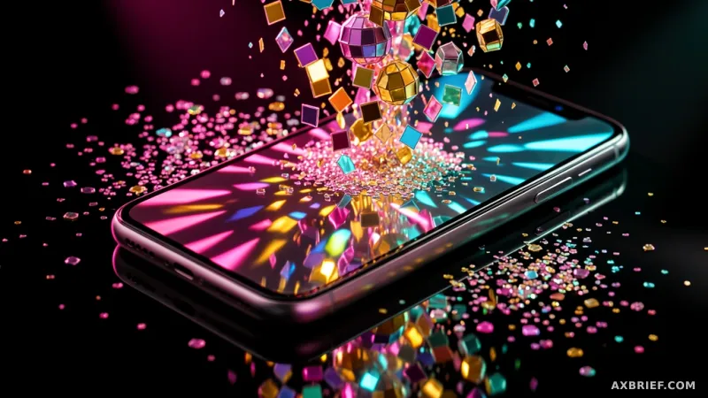
For years, the Android home screen has followed a trajectory of disciplined harmony. Google's Material You design language taught users to appreciate a world where app icons subtly shift their hues to match the wallpaper, creating a cohesive, pastel-toned sanctuary. It was a triumph of functional aesthetics, but it was also predictable. This week, that predictability shattered as Google decided to trade minimalist coordination for the chaotic energy of a dance floor, turning the Pixel home screen into a shimmering mirror ball.
The Pixel Drop and the Rise of the Disco Ball
On Friday, May 22, 2026, Sameer Samat, the executive overseeing the Android ecosystem, took to X to unveil a provocative new addition to the Pixel customization suite: the Disco Ball theme. Upon activation, every app icon on the user's home screen transforms into a glittering, reflective sphere. The update is not a random whim but a calculated response to a viral moment in the digital culture sphere. Recently, Spotify sparked a massive online conversation by introducing a temporary disco ball icon to celebrate its 20th anniversary. While some users found the design jarring, the internet's fascination with the aesthetic provided Google with a perfect opening to inject some levity into the OS.
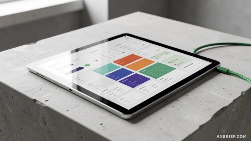
This feature serves as an expansion of the custom icon framework first introduced during the Pixel Drop in March. For those unfamiliar, Pixel Drops are the periodic feature bundles Google pushes to its hardware users to keep the device feeling fresh between major OS versions. Before the Disco Ball, Google had already begun experimenting with AI-generated style templates. These included Scribbles, which gives icons a hand-drawn, whimsical feel; Treasure, which applies a lavish gold finish; and Easel, which mimics the texture of a painter's canvas. Samat's rollout of the Disco Ball theme followed a period of community teasing, where he posted images of a disco-themed Chrome icon to gauge user appetite before flipping the switch for a global release.
From Color Matching to AI-Generated Textures
To understand why a disco ball matters, one must look at the technical shift occurring under the hood of the Pixel UI. For several generations, Android's customization was based on color extraction. The system would analyze the wallpaper's palette and apply a monochromatic tint to the icons. It was essentially a digital version of matching your tie to your shirt—a safe, harmonious choice that focused on visual unity. The new AI-driven approach, however, represents a fundamental departure from simple color values to complex style templates.
Instead of merely adjusting a hex code, the system now uses AI to reinterpret the icon's form and texture. When a user selects the Disco Ball theme, the AI doesn't just change the color to silver; it applies a template that simulates light reflection, depth, and the specific faceted geometry of a mirror ball. This is the difference between applying a color filter to a photo and completely redrawing the subject in a different artistic medium. The AI recognizes the basic silhouette of the app icon and overlays a generated style that maintains the icon's recognizability while completely altering its material essence.
This evolution transforms the home screen from a utility board into a digital canvas. By moving away from the strict constraints of a system-defined color palette, Google has handed the creative control back to the user, albeit through the lens of AI-curated styles. The technical achievement here is the real-time reconfiguration of the interface. Every time a user switches from Scribbles to Disco Ball, the system is performing a sophisticated mapping operation, ensuring that the AI template wraps correctly around diverse icon shapes without breaking the visual language of the OS.
The Psychology of Play and the Zillennial Interface
The market reaction to the Disco Ball theme highlights a growing divide in how different generations perceive digital utility. When Spotify first debuted its mirror ball icon, critics argued it was too distracting and eroded brand identity. Google, however, viewed this friction as an opportunity. By integrating the trend into the Pixel OS, Google effectively signaled that it is willing to dismantle its own rigid design guidelines in favor of technical humor and user whim. This strategy aligns perfectly with the preferences of Zillennials—the cusp of Gen Z and Millennials—who increasingly reject the sterile, hyper-optimized interfaces of the early 2020s.
For this demographic, a slightly inefficient or visually loud interface is a feature, not a bug. It is a way to project personality in an era of algorithmic uniformity. Social media reactions to the update have been overwhelmingly positive, with users describing the experience as receiving a champagne service on their home screen. The appeal lies in the absurdity; the idea that a high-powered AI tool, capable of complex reasoning and productivity, is being used to make a calculator app look like a party decoration is precisely the kind of irony that resonates with modern users.
This shift suggests that the next frontier of mobile competition isn't just about processing power or camera megapixels, but about emotional resonance. Google is betting that the ability to evoke a smile or a sense of playfulness is as valuable as a productivity shortcut. By transforming the app icon from a mere launch button into a piece of visual jewelry, Google is redefining the relationship between the user and the machine. The Disco Ball is not just a theme; it is a manifesto stating that the smartphone should be a place of joy and experimentation rather than just a tool for efficiency.
Ultimately, this update proves that the most impactful AI implementations aren't always the ones that solve a complex problem, but the ones that understand a human joke.